Designing for a parliament means designing for high stakes, zero tolerance for confusion, and users who have no time to learn a new tool. I owned three modules: room capacity, events, and search.
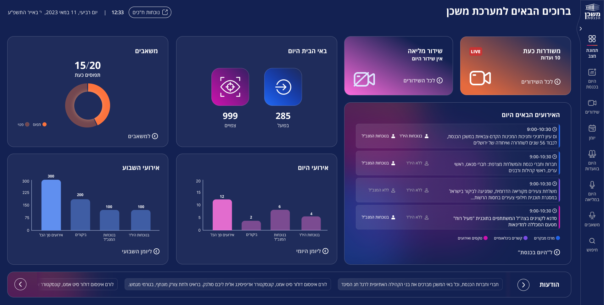
Ten people running a parliament with no shared view
The Knesset's senior executive team managed daily operations across dozens of rooms, concurrent events, and international delegations, all from disconnected tools. There was no single place to see what's happening right now, plan what's coming, or find what happened before.
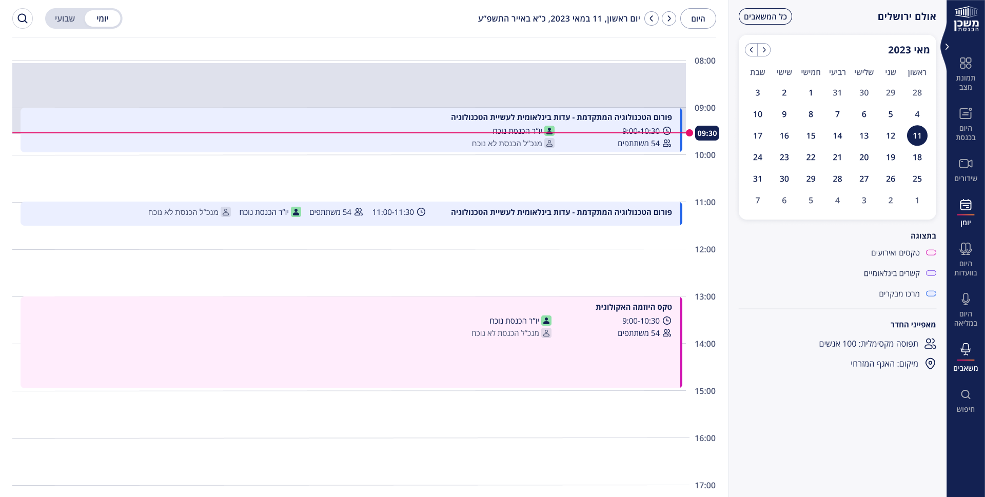
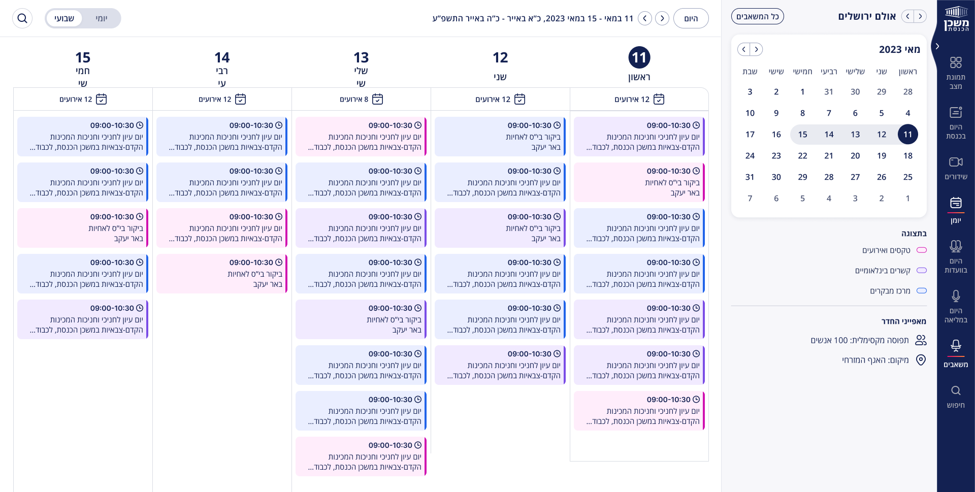
Every room. Every hour. At a glance.
The room capacity module needed to show the full picture of the Knesset building — which rooms are occupied, by what type of event, and for how long. I designed three layers: a daily timeline view, a weekly overview, and a drill-down into a single room. Color became the primary language: pink for ceremonies, purple for international relations, blue for visitor center. The team could read the schedule without reading a single word.
The decision the developers didn't want to make
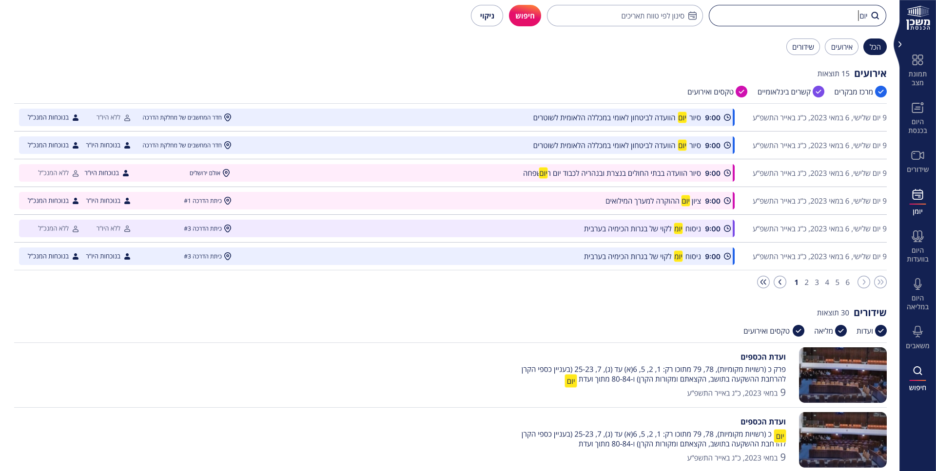
The developers proposed a flat, Google-style results page. I pushed back. Users come to search with a context already in mind. They know if they're looking for an upcoming event or a past session recording. Flattening everything into one list would make them work harder to find what they already know exists. I proposed grouping results by section. That's what we shipped.
A single flat list of results sorted by relevance, like a search engine.
Results grouped by section: events in one block, session recordings in another. Users scan by context, not by relevance score.
"This project taught me that working agile in a high-stakes environment isn't about moving fast. It's about making the right call fast. Owning three modules end to end, staying close to the developers, and knowing when to push back on a technical decision that would hurt the user. That's where the real design work happened."