
When hospital systems go down — server failures, wartime scenarios — doctors lose access to patient records. I designed the interface that restores that access, fast and under control.
Decisions under extreme pressure
The user is a hospital IT technician — not a doctor. They receive an emergency call, need to grant medical staff access to patient records, and log the event — all within minutes, without errors. The existing process was manual, scattered, and impossible to audit.
Understanding the real workflow
I sat with the IT staff who actually manage these logs — and separately with the developers who would build the system. Two very different perspectives. The IT staff cared about speed and not making mistakes. The developers cared about data integrity and auditability. The design had to serve both.
"I need to know exactly who I'm giving access to — and I need to do it in under two minutes."
"Every action needs to be logged, timestamped, and exportable. This is medical data — there's no room for ambiguity."
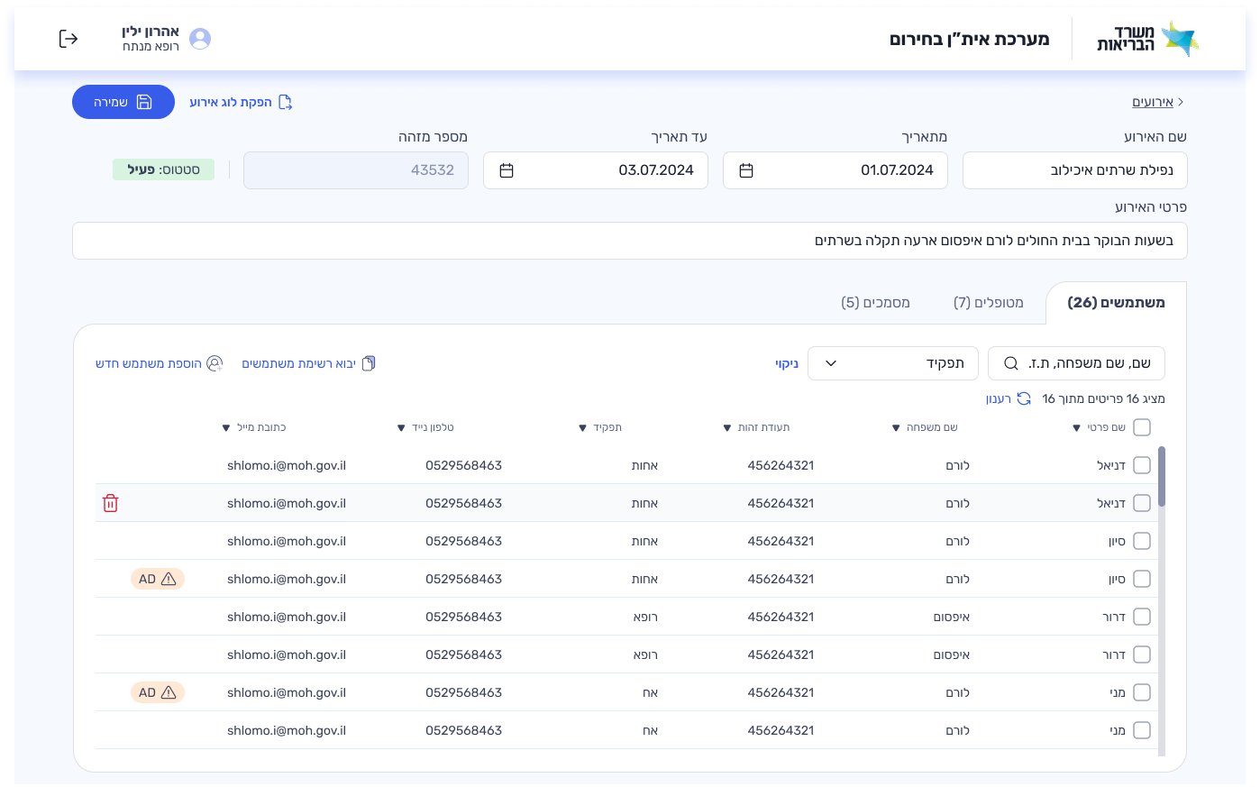
Save first, everything else second
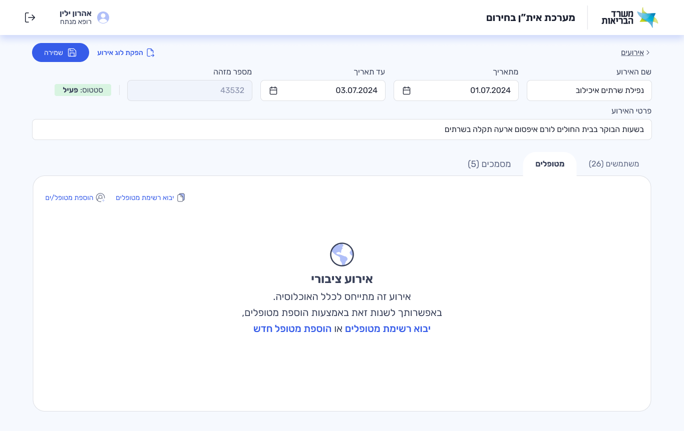
The primary action — saving the event log — had to be the most prominent element on screen. Information was organized into three tabs: users, patients, documents. Under full pressure, the IT technician can find who they need and grant access without confusion.
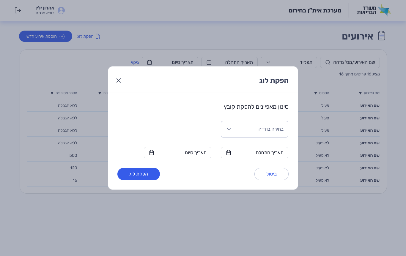
Export logs. Import lists. Stay in control.
Every access event is timestamped and exportable. Staff lists can be imported in bulk — no manual entry under pressure. The system was built to be audited, not just used.
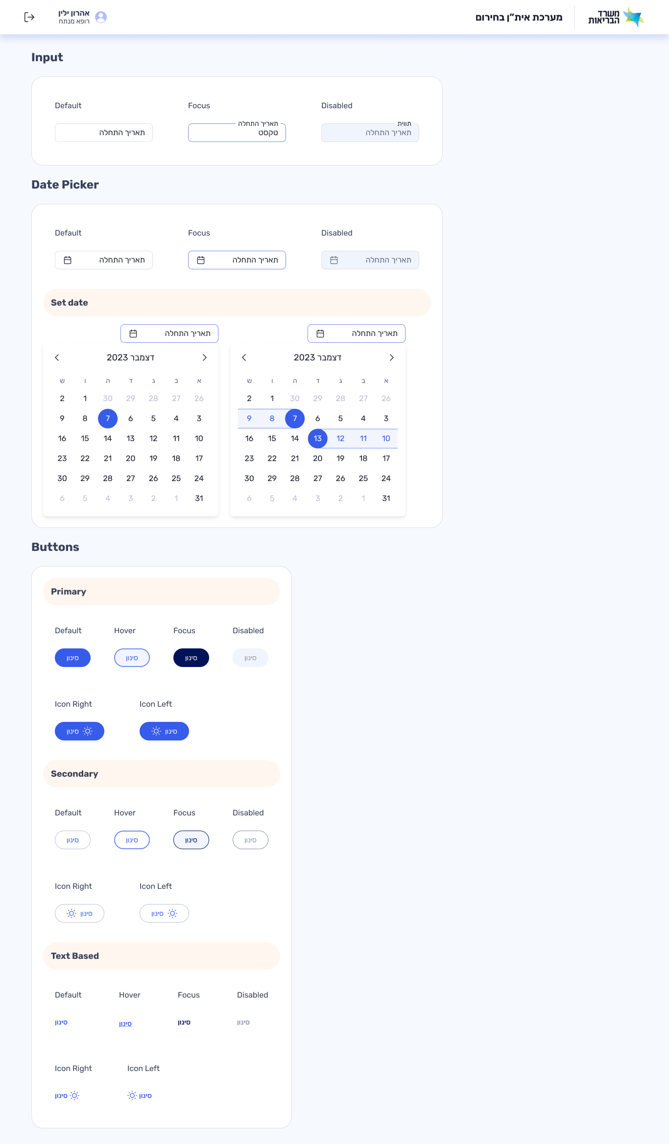
A style guide the developers actually asked for
Built on the Ministry of Health design system, I created a component-level style guide tailored to this product. The developers requested it explicitly — they needed a single reference for spacing, color, typography and states.
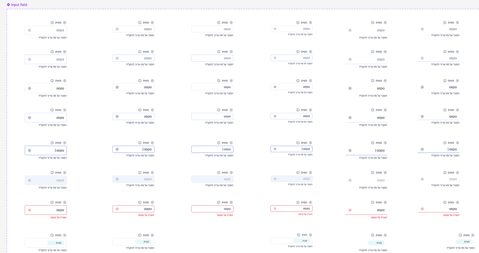
Input Field
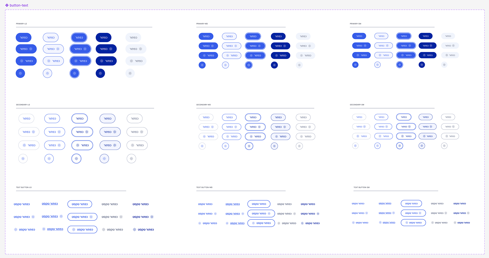
Buttons
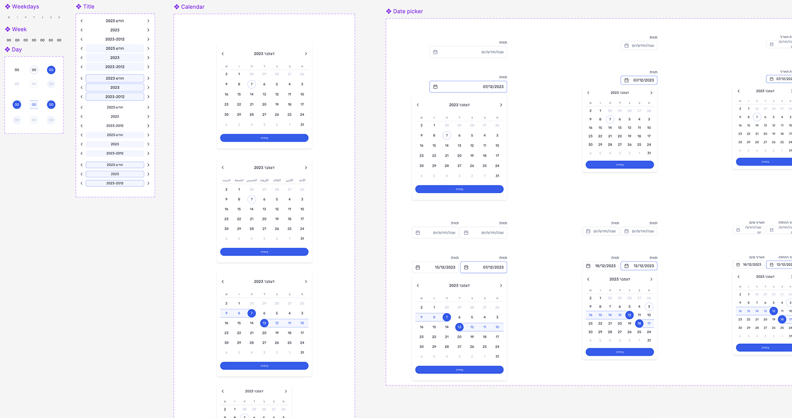
Datepicker
"Internal tools are invisible when they work. But when they fail — in an emergency, in wartime — someone pays the price. This taught me that the most important UX isn't the beautiful app. It's the tool an IT technician opens at 3am."